Mapping Global Migration
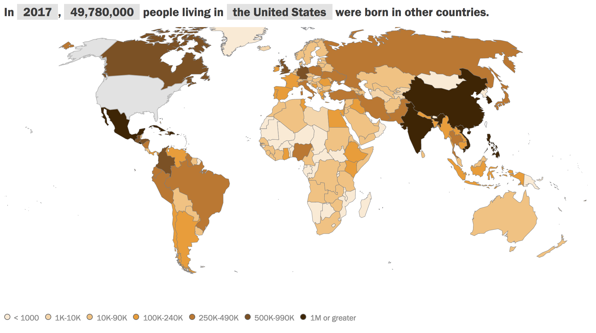
Earlier this year, the Pew Research Center published an interactive map on their website that shows migration patterns around the world since 1990. The map allows users to view migration in and out of each country, for the years 1990, 2000, 2010, and 2017. Below is more information from Pew's website:
"The figures in this interactive feature refer to the total number (or cumulative “stocks”) of migrants living around the world as of 1990, 2000, 2010 or 2017 rather than to the annual rate of migration (or current “flows”) in a given year. Since migrants have both an origin and a destination, international migrants can be viewed from two directions – as an emigrant (leaving an origin country) or as an immigrant (entering a destination country).
'According to the United Nations Population Division, an international migrant is someone who has been living for one year or longer in a country other than the one in which he or she was born. This means that many foreign workers and international students are counted as migrants. Additionally, the UN considers refugees and, in some cases, their descendants (such as Palestinians born in refugee camps outside of the Palestinian territories) to be international migrants. For the purposes of this interactive feature, estimates of the number of unauthorized immigrants living in various countries are also included in the total counts. On the other hand, tourists, foreign-aid workers, temporary workers employed abroad for less than a year and overseas military personnel typically are not counted as migrants."
It is a fascinating map, and one that might inspire more questions as users explore the data from each country. Some trends can likely be connected to events occurring in those countries: between 1990 and 2000, the number of Rwandans living in the Democratic Republic of the Congo increased dramatically, from 20,000 to 90,000, likely due to the 1994 genocide (and that number has continued to grow to 300,000 in 2017). Greek migrants living in other countries followed a downward trend until after 2010, when the number had increased again by 2017; this might be connected to the Greek government-debt crisis that began in 2009. Other trends are less obvious: why did the United States surpass Hong Kong in the number of Chinese migrants between 2000 and 2010? And what is the draw for Brazilians to move to China? Their numbers increased from 10,000 in 1990 to 80,000 in 2017, and since 2000 they have been in the top three countries for migration to China.
When you are done exploring Pew's Global Migration Map, you can also check out their Remittance Flows Worldwide interactive map. It works in the same way, except that with this map, you can see the trends in remittances (or money sent from migrants in other countries to their families back home) sent around the world in the year 2016. Here is what Pew has to say about this map:
"Worldwide, an estimated $574 billion (USD) was sent by migrants to relatives in their home countries in 2016, a 1% decline from 2015, when the amount was $581 billion, according to economists at the World Bank. This is the second drop in global remittances since the global financial crisis. Despite this recent decline, remittances sent by migrants are still about double what they were a decade ago, before the sharp decline in the global economy during the late 2000s.
Tracking remittances worldwide is difficult because many countries do not track funds that are sent or received. Based on data it is able to collect, the World Bank has used a statistical model to estimate the amount of money coming from each sending country to each receiving country. Because these numbers are estimates, there is some room for error. For example, the total incoming or outgoing remittances for some countries may not be the same as actual remittances."
What trends in these maps fascinate you the most? Let us know over on Facebook.